|
|
Post by Host Petra Nemcova on Aug 22, 2008 17:33:43 GMT -5
Welcome, ladies. This week, 2 of your recently eliminated models returned as guest judges. Say hello to Du Juan and Ana Beatriz Barros!  Lets begin the critique. |
|
|
|
Post by Host Petra Nemcova on Aug 22, 2008 17:45:27 GMT -5
Lets begin with the lovely Coco Rocha: Petra: Wow. Coco, I am so impressed by everything. Ever heard of going out with a bang? Well, this final photoshoot has been just that. I love the music with the commercial. The first half seems very creepy and edgy, while the second half advertises the product to a great extent. The runway was good...not excellent, but still good. Du Juan has a point when she says that there were only a few that really were WOW. Your first picture reminded me a lot of your walk. Its great. Your face seems almost magnetic and I love the edginess of the shot. The second picture is a bit iffy. Its vintage, but in a good way, and though I love the make-up, you look dazed. The third picture is very special and gives me a good way to wrap up all of your shots. They are all different, even if they show just mainly the bust of Coco. It makes it easier to focus on the main differences, rather than the angles or body. Du Juan: I just love the commercial. It is a very unique idea and I love how beautiful you looked. You can pull off a commercial looking very fierce. Runway:There were only a couple of runways you did that I liked but I wasn't THAT impressed. Some of your walking was a bit too awkward and I didn't like your face expressions in some of them. But I think you had very unique outfits. Pictures:I love how fierce you look in the first picture but I was more drawn into your face than the Hello Kitty watches. It's good that I am drawn to you but you are advertising the watches. The second picture is very blurry and you seem to have the same expression like the first picture. But I love the make up and you seem very lost. The third picture is just wonderful and it's very different and unique. I wish you could've added some explanations on each different look. Ana: WOW!! coco yout commercial blew me away I loved it!! you totally worked then i really liked that one, my fav of your submissions your runway was great work on the runway you gave a wide variety of outfits, and poses! your walk was great to very strong for your pictures i loved the third one it was great! the first I found a bit boring but the second and third were great!!! |
|
|
|
Post by Host Petra Nemcova on Aug 22, 2008 17:57:10 GMT -5
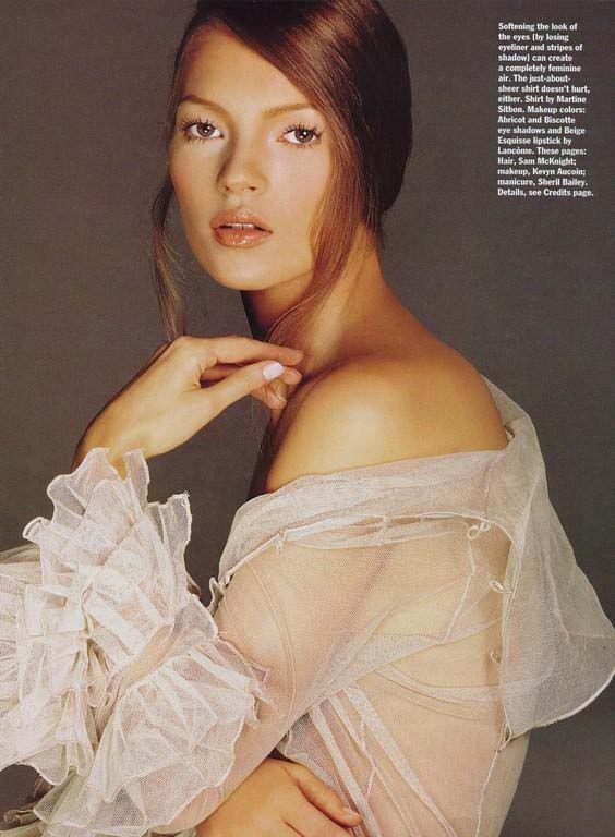
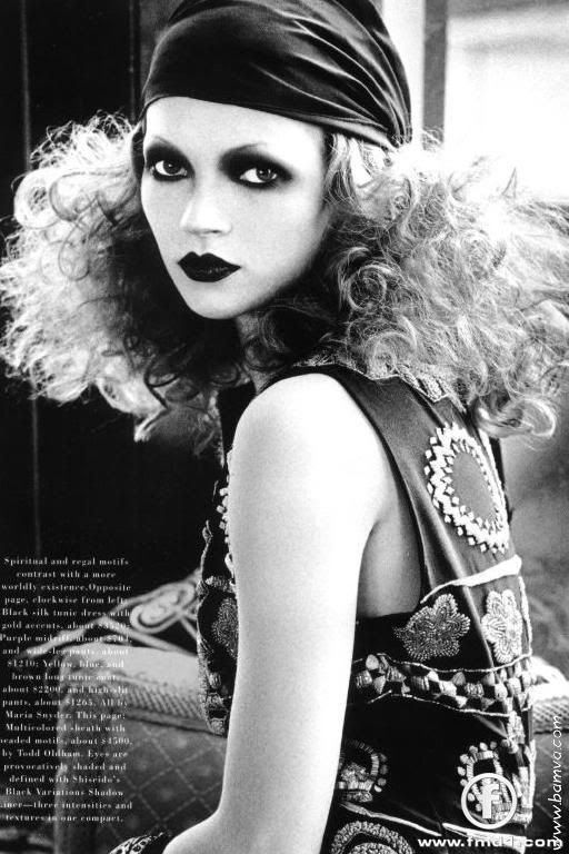
Next up is Kate MossPhoto Shoot #11RUNWAY- COMMERCIAL- PHOTOS SHOWING 3 DIFFERENT SIDES TO KATE:  This photo shows a soft and sensual, yet innocent side of Kate.  This editorial photo, done in black and white, represents the pop culture of the 80's, modeled after, Andy Warhol's movie "Chelsea Girls", in which he showed the women who lived in the Hotel Chelsea in New York. The black and white was representative of the film's backdrop and the curly hair, the dark lips, and the pale skin are prevalent for the era.  This photo shows the sultry, sexy side of Kate with that little bit of innocence showing through. Petra: I think that the commercial was way too long. It got a bit boring, even though you looked phenominal. I loved the professional-attitude to the runway. It was really good and, like Du Juan said, your posture is great.  All of your pictures are great, I think. Your face could use a bit of work in the first shot, but it is soft and the differences are visible. I love your final shot. Its possibly my favorite shot I've seen of you ever. Du Juan: I liked how seductive you looked in your commercial but I still found it very boring and I didn't see much of you in this commercial. I was mostly seeing the perfume and the bottle actually outshined you. Runway:Ugh I couldn't stand the music but I couldn't stop watching you. There was parts where you really looked beautiful and fierce. I loved your posture and I can see actual confidence during the runways. Pictures:I really loved all your pictures and I noticed how different you looked in each one. The first picture seemed a bit lost but your two other pictures make up for it. I'm glad you wrote explanations in your pictures also. Ana: ok for your commercial I found it boring and you could have done better BUT it wasnt bad the second time I watched it it was better i didnt cathch my attention like others did but your runway was amazing your walk was great you poses were fresh and for your pictures i think you did really well and you a very versitile model! |
|
|
|
Post by Host Petra Nemcova on Aug 22, 2008 18:03:16 GMT -5
Finally, we have Lily ColeWeek 11: Final PhotoshootOkay...I seriously couldn't find a runway video of Lily Cole with just one runway shot. I really hope this video is acceptable. I know it's not a commercial, but I figure this is better than nothing at all. I seriously couldn't find any commercials featuring Lily Cole. I really do apologize. And, my three photos... Magazine Cover Advertisement Advertisement Runway Shot Runway Shot Petra: Lily, you were allowed to have more than one runway capture in the video. This video is just dissapointing. none of the walks are that strong. The commercial wasn't quite a commercial, but we give you points for trying and showing a sweeter side. Like the other judges, I wish you would have shown us your model doing different things, and not just different editing. However, I liked the cover and the advertisement. Both were good. I love the runway shot, I think it shows personality. |
|
|
|
Post by Host Petra Nemcova on Aug 22, 2008 18:03:37 GMT -5
The elimination will be up tomorrow morning.
|
|
|
|
Post by Kate Moss on Aug 22, 2008 21:16:55 GMT -5
Thanks judges for your critiques. Good luck Coco, and Lily  |
|
Du Juan
Cycle Two Global Model    Winner Of GTM Cycle 1
Posts: 62
|
Post by Du Juan on Aug 22, 2008 22:16:12 GMT -5
I wish you three luck.
|
|