|
|
Post by Host Petra Nemcova on Jun 22, 2008 10:40:23 GMT -5
Welcome, ladies, to your seventh critique. Lets begin and sorry for the delays
|
|
|
|
Post by Host Petra Nemcova on Jun 22, 2008 10:42:11 GMT -5
Izabel Goulart: Clothes/No Clothes  Petra: Individually, I like them both. Together, they are complete opposites. Overall, I love it. The clothes one looks very edgy and it looks like something from a catalouge while the no clothes one is just...sexy. Dominique: Yeah, I agree. Both look sexy. And they're definetly opposites. They both look professional, but still hot. |
|
|
|
Post by Host Petra Nemcova on Jun 22, 2008 10:45:38 GMT -5
Lily Cole: Fantasy/Reality   Dominique: They're both nice shots, but not quite as easy to tell apart as the other. Plus, the people in the window scare me. I like what she's doing with her hands though. It makes it look like she wants to fly or something lol. Petra: Really? I love this! Again, great job. The fantasy shot's pose is great for a fantasy theme. The outfit with the setting makes it very much like a dream. In the Fantasy one, Lily, you look confused, whereas in Reality, you look in control. The reality one is also something I could see walking down the street. I can't take my eyes off of the fantasy one, I agree about what you say about the pose. |
|
|
|
Post by Host Petra Nemcova on Jun 22, 2008 10:47:14 GMT -5
Du Juan: Lost (Shy) and In Control (Seductive)  Dominique: I love it! The first one she looks lost, wearing something you wouldn't wear at a beach and then in the next, she looks like she knows what is going on. She looks like she is going after something. Petra: Again with the eyepatch hairstyle in the confident one, Du Juan. I like them both, but I think the differences are very sophisticated. They're not as obvious, but it really does show what little gestures and expressions can do. Overall, phenominal job. The second one looks totally feirce and the first looks like a deer in the headlights..but in a good way. |
|
|
|
Post by Host Petra Nemcova on Jun 22, 2008 10:49:57 GMT -5
Coco Rocha: Fierce and Soft  Dominique: Another great job! The fiercest we've seen you yet and you look soft and happy in the other. The two models don't even look like the same person! Petra: I love that the differences are so extreme, but the models don't even look alike. That can be good, or it could be bad. I would prefer to see just a little bit of similarity, whether it was both full body shots or both upper torso shots. The first one looks great, the second look great, but together I don't understand them. In Izabel's, you can tell its the same model, but they are still polar opposites. In this, I can't tell that its the same model, I just see two shots that don't really go together, but I still love the effort and the vast differences. |
|
|
|
Post by Host Petra Nemcova on Jun 22, 2008 10:50:22 GMT -5
Others up later today..
|
|
|
|
Post by Host Petra Nemcova on Jun 22, 2008 12:02:16 GMT -5
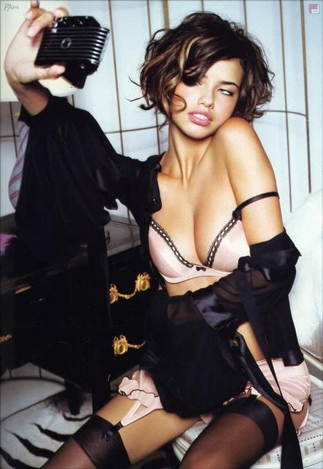
Adriana Lima: Classy and Trashy  Dominique: The differences are fairly noticeable although she doesn't look trashy in the trashy shot. But the classy is amazing, looks very business like. I think the trashy shot just shows her living up to a lifestyle that is stereotyped to be trashy. Petra: I love the differences, Adriana. The first one appears to be very high class and regal, while the second looks like a future pornstar. Individually, the second one would be hated by the panel, but when compared to this classy shot, the shots help contrast one another. I really like it, but I think the trashy picture could be better. I love the classy one, though. |
|
|
|
Post by Host Petra Nemcova on Jun 22, 2008 12:06:51 GMT -5
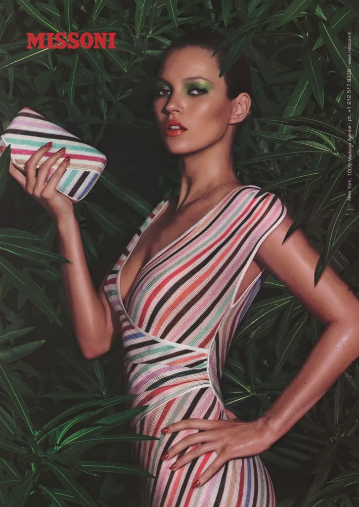
Kate Moss: Different Hairstyles  Petra: Individually, these pictures are stunning. I love the classiness and glamour of the first shot while I love the edginess of the second. However, like Coco, I think these shots don't go together. A similar stance might have helped, but because there are multiple differences, the shots aren't contrasted to the fullest extent. Dominique: I agree with Petra. Seperate, the shots are great. But I just don't think they go together. I know Petra said she wanted polar opposites, but think of it this way. The first shot is indoors, she's lying down, and she has long hair. The second shot is outside, she's standing up, and she has short hair. I just get the feeling that there's too many differences. |
|
|
|
Post by Host Petra Nemcova on Jun 22, 2008 12:12:09 GMT -5
Ana Beatriz Barros: Beach Bum and Country Chick  Petra: Okay, as you said in your submission, you did not go the route that most people did. Rather than doing physical differences, you chose pictures that had different settings as well as behaviors, which I applaud you for. In the country shot, you look ready to work and like a typical farm girl. However, I think you look a little bit confused with your facial expression while your body looks in control. As for the beach shot, you look relaxed and gorgeous. I see the literal differences, but when I stop to take time at the pictures, I see many more differences. Dominique says: I agree with Petra again. The second shot is sexy while the first shot shows a hard working girl as well. |
|
|
|
Post by Host Petra Nemcova on Jun 22, 2008 12:57:47 GMT -5
I know Yesica did not make comments, but she did rankings. I am just waiting on Dominique's final rankings before I can do the elimination.
|
|
|
|
Post by Kate Moss on Jun 22, 2008 14:38:21 GMT -5
Just wondering..how can two photos be "too opposite" from each other, when the challenge stated that they were to be "polar opposites"? Did you want similarities?
|
|
Du Juan
Cycle Two Global Model    Winner Of GTM Cycle 1
Posts: 62
|
Post by Du Juan on Jun 22, 2008 14:49:10 GMT -5
Thanks Judges
|
|
|
|
Post by Host Petra Nemcova on Jun 22, 2008 16:31:10 GMT -5
Just wondering..how can two photos be "too opposite" from each other, when the challenge stated that they were to be "polar opposites"? Did you want similarities? Your shots were polar opposites..but they were polar opposites in more than one way, which made it sort of difficult to relate the two photos as opposites. I hope that makes sense.  |
|